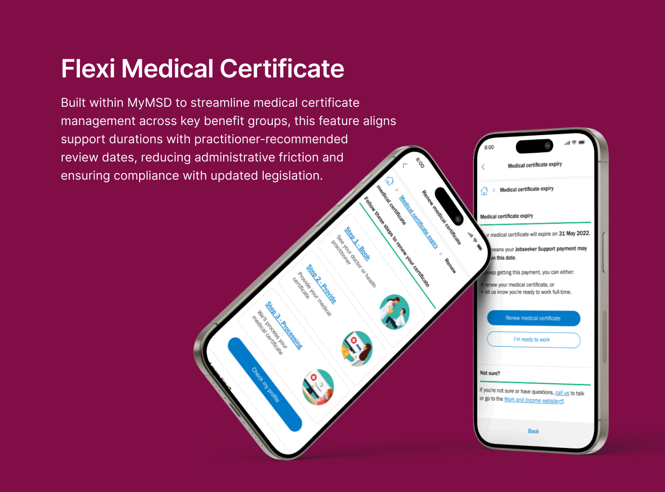
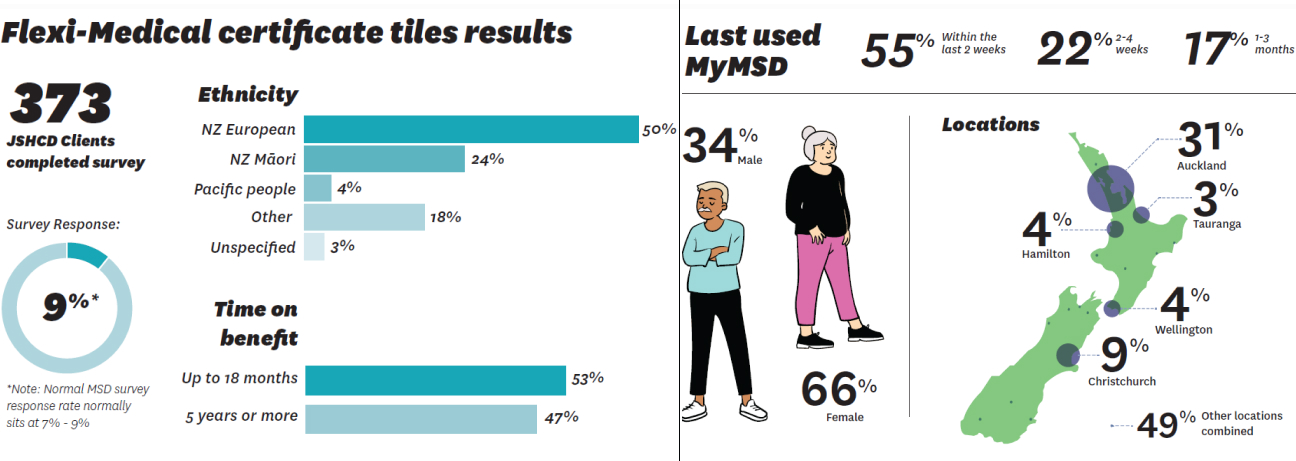
Flexi Medical Certificate
Project information
- Category: Government Web application / Self-service Digital Platform
- Client: Ministry of Social Development
- Project date: July 2021 - January 2022
- Project URL: my.msd.govt.nz
- Mobile Relevance & Platform Strategy
Note: The actual feature is not publicly accessible, as it is part of a client-based experience. Please refer to the wireframes and final design shown.
Although delivered within a responsive web platform, all design decisions prioritized mobile-first usability, accessibility, and delivery feasibility across breakpoints. Layouts were validated to ensure clarity, touch-friendly interaction, and WCAG compliance on smartphones and tablets. UI components were designed to scale fluidly across devices, with simplified navigation and reduced cognitive load tailored for mobile users.
Role & Responsibilities
- Role: Senior UX/UI Designer
- Key contribution: UX/UI Design, Visual Design & Illustration, Ideation & Concept Development, Accessibility & Inclusive Design, Prototyping & User Testing
Overview
I led the design and implementation of the Flexi Medical Certificate feature within MyMSD, a digital platform that enables beneficiaries across New Zealand to manage their interactions with the Ministry of Social Development (MSD). This initiative aimed to transform how medical certificates are managed for key client groups, including:
- Jobseeker Support – Health Condition, Injury or Disability
- Young Parent Payment
- Youth Payment
- Sole Parent Support
- Supported Living Payment and partners of JS HCID and SLP clients
Objective
The core objective of this functionality was to align MSD’s certificate management process with medical practitioners’ recommended review dates, ensuring that clients receive support that reflects their actual health needs. This change not only enhanced the client experience by reducing unnecessary administrative friction but also enabled MSD to comply with updated legislative requirements.
Emphathise
Early discovery work — including initial client feedback, call‑centre patterns, frontline staff observations, and accessibility reviews — showed that clients often struggled to understand what was required of them when submitting medical certificates. Information felt unclear, cognitively heavy, and at times emotionally overwhelming, particularly for those with lower digital confidence or navigating sensitive personal circumstances.
Define
Problem Definition
Through synthesising call‑centre insights, frontline staff observations, cultural guidance, and accessibility reviews, we identified a clear, human‑centred problem. The existing medical certificate experience created cognitive, cultural, and emotional friction — particularly for clients with diverse backgrounds and varying levels of digital literacy.
Point of View (POV) Statement
Clients with diverse needs require a clear, reassuring, and accessible way to understand their medical certificate requirements because the existing experience is unclear, cognitively heavy, culturally misaligned, and creates emotional friction during a sensitive time.
Key Design Challenges
Two primary challenges shaped the design direction:
- Clarity & cognitive load : Clients struggled to understand what was required of them, with instructions feeling unclear and cognitively heavy.
- Emotional friction : The experience created stress and uncertainty during an already sensitive process, especially for clients with varying levels of digital confidence.
These challenges guided the design direction toward a clearer, more supportive, and more user‑friendly experience.
Ideate
Reframing the Problem (How Might We Questions)
After synthesizing our empathy findings, we used the following "How Might We" (HMW) questions to guide our brainstorming and concept exploration:
How might we make the experience feel more reassuring and less formal for clients?
How might we use visuals and clearer guidance to reduce cognitive load?
How might we ensure the experience is inclusive and respectful for diverse clients?
Concept Exploration & Co-creation
I facilitated design workshops in our design lab, collaborating with stakeholders, developers, and cultural advisors to co-create ideas and validate design directions. This collaborative process helped generate ideas for illustrations, UI components, and accessible design patterns that directly addressed our HMW questions.
Key Concepts Explored
- Empathetic illustrations: A cohesive set of illustrations to support key content and instructions.
- Improved UI patterns: Restructured layouts, simplified input fields, and clearer feedback mechanisms aligned with accessibility standards.
- Refined UX flows: Streamlined the journey so clients clearly understand what they need to provide and what happens next.
By integrating thoughtful illustrations with refined UX flows and scalable design patterns, I helped transform the feature into a more inclusive and emotionally intelligent experience—especially for users navigating sensitive situations.
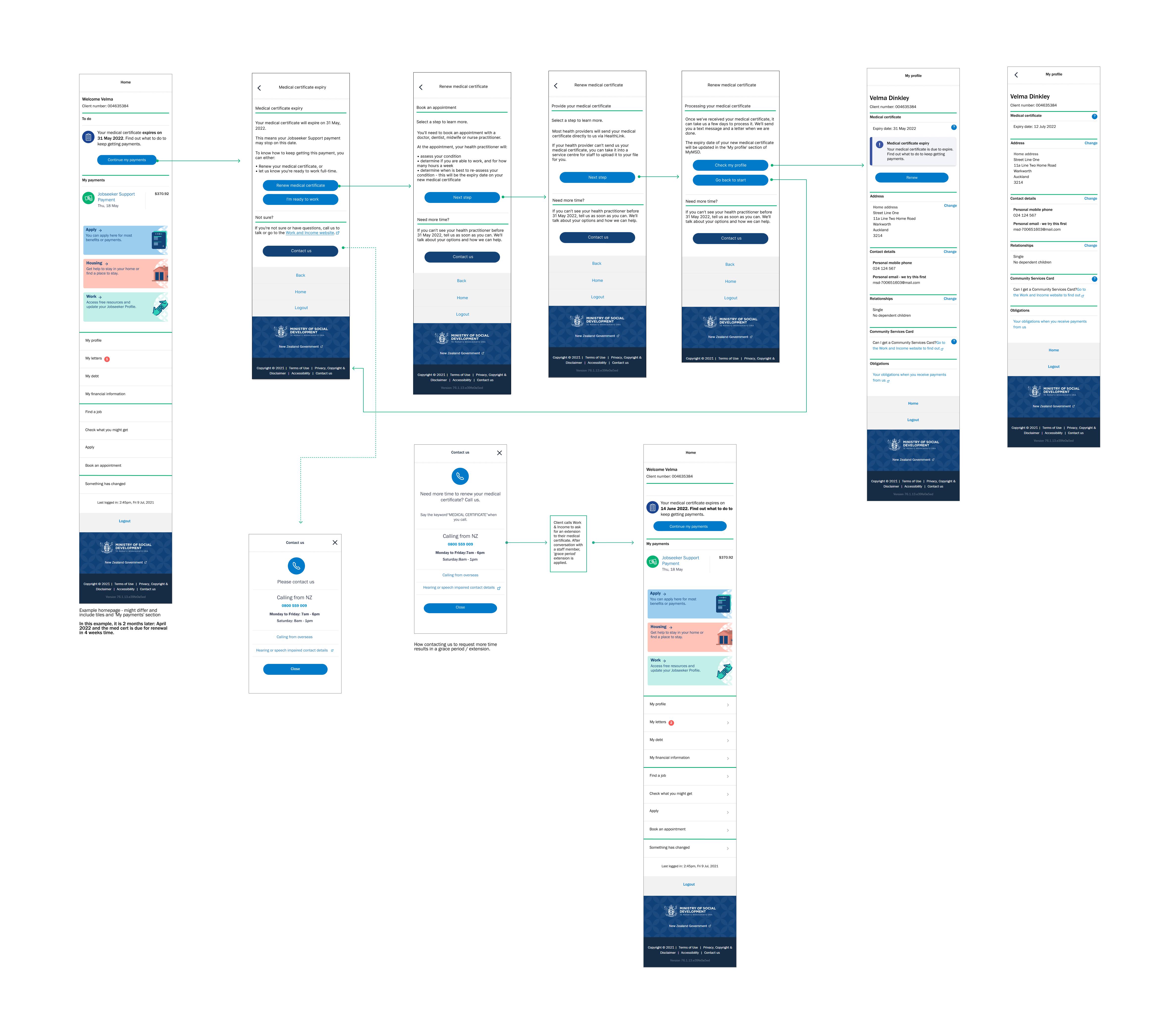
Prototype
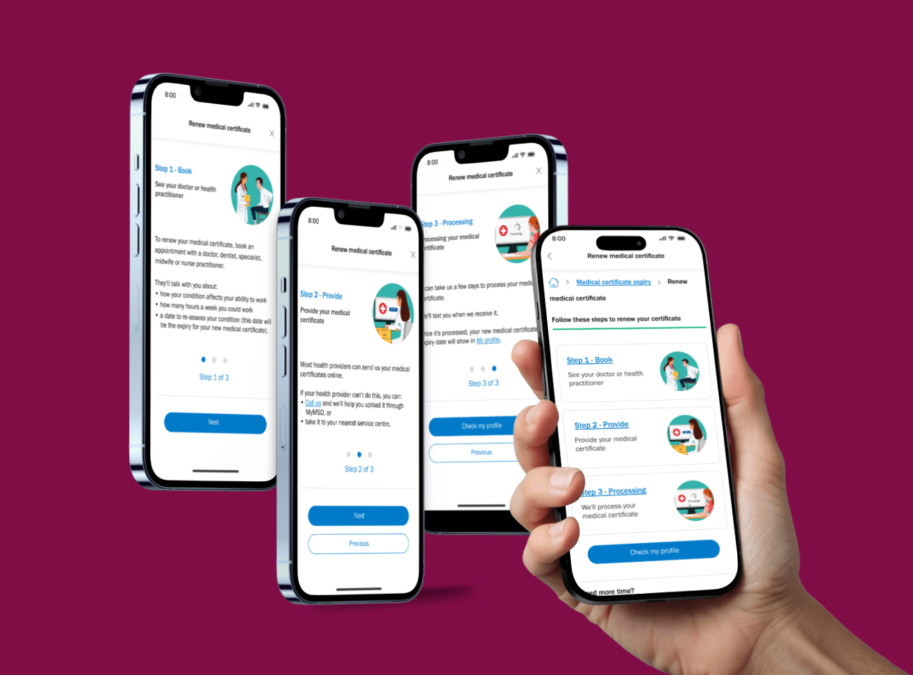
wireframes after
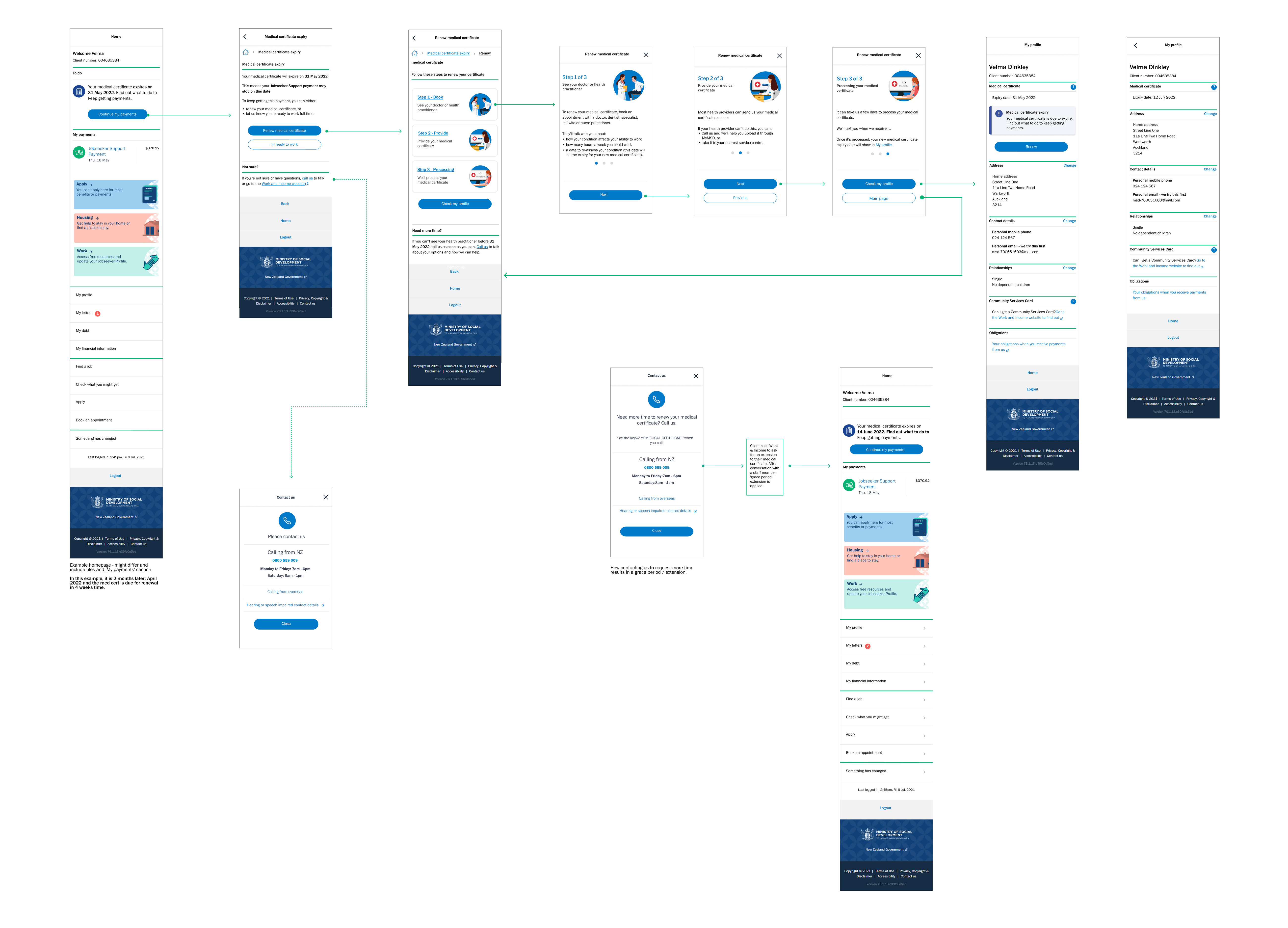
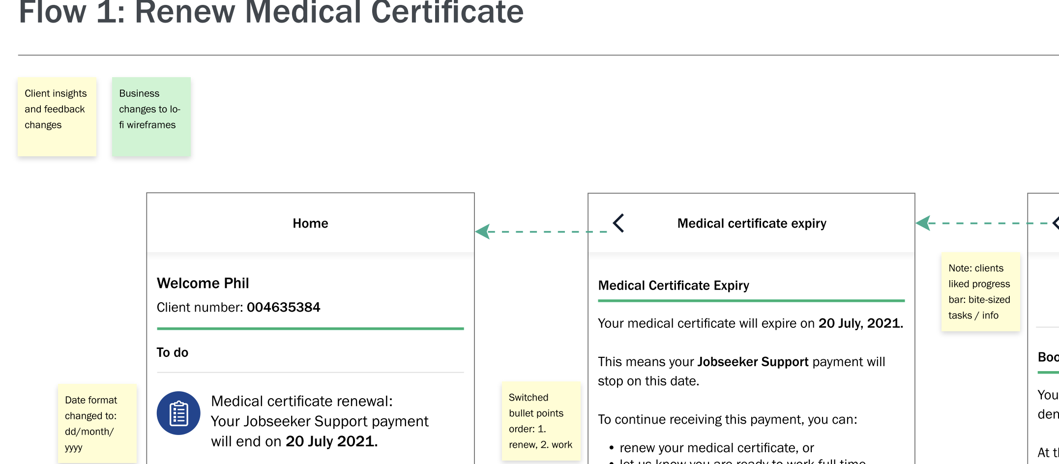
I developed wireframes in Figma to simplify the medical certificate guidance and add contextual support. These evolved into interactive prototypes used for internal reviews and preparation for the first round of usability testing.
Early client feedback showed that users appreciated bite‑sized steps and clear orientation, which initially suggested a progress bar. However, once the business removed the upload capability and simplified the flow, a traditional progress bar was no longer appropriate.
Because the design system did not include a slider component, I extended the existing modal pattern to present the guidance in three simple, illustrated screens with seamless slide navigation. This preserved the clarity and reassurance users valued while remaining consistent with the design system and technically feasible.
User Testing & Insights
- Illustration Style 2 was the most preferred, receiving 42% of the vote, and was described by users as “Simple,” “Clear,” and “Detailed.”
- The other styles received 36% and 22%, respectively.
- Some visuals—such as sand timers and pot plants—were found to be confusing or culturally irrelevant.
These insights informed future design decisions and helped ensure the experience was inclusive and approachable for users with varying literacy levels, cultural backgrounds, and emotional sensitivities.
Iterative mapping choreographed the full UI flow, guiding the evolution of certificate guidance, illustration placement, and feedback states with clarity, emotional resonance, and accessibility precision.
Testing
Validate
To ensure the Flexi Medical Certificate experience was intuitive, inclusive, and operationally feasible, I facilitated a cross-functional Design Lab session with key stakeholders:
- Digital Product Owner and Product Manager — to validate scope, prioritization, and release feasibility
- Developers — to validate technical feasibility, CMS constraints, and responsive behaviour
- Accessibility Team — o ensure WCAG compliance, screen‑reader support, and inclusive interaction patterns
- Comms and Content Team — to refine tone, language clarity, and emotional resonance
- Co‑designers — to ensure the experience remained grounded in client needs and frontline realities
Session goals
- Validate illustration tone for emotional neutrality across cultural contexts
- Test clarity of certificate guidance and feedback messaging
- Identify accessibility risks in layout, navigation, and hierarchy
- Align content and UI with MSD’s inclusive design standards
Flow maps and annotated prototypes were refined iteratively throughout the design process, not just during the session. Each review cycle helped validate logic, surface risks, and evolve the experience based on real-time feedback from cross-functional stakeholders.
Outcomes
- Selected Illustration Style 2 for clarity and cultural adaptabilityy
- Refined onboarding tone and visual hierarchy for emotional clarity
- Validated accessibility features: screen reader support, keyboard navigation
- Confirmed technical feasibility across devices
- Strengthened cultural neutrality through simplified messaging and inclusive visuals
This session served as a strategic checkpoint — aligning design intent with technical feasibility, accessibility standards, and cultural neutrality to ensure the final experience was inclusive, trustworthy, and delivery-ready.
Agile Collaboration & Delivery Framing
The Design Lab mirrored agile ceremonies, functioning as a sprint checkpoint to align backlog priorities, validate feasibility, and de-risk delivery. Annotated prototypes supported seamless developer handoff, while feedback loops with content, accessibility, and service advisors ensured the solution was technically sound and user-centered.
Final Design
The final design brought together refined UX flows, culturally sensitive illustrations, and accessible UI components. It significantly improved clarity and emotional engagement, helping users better understand key actions such as providing medical certificates and checking their status.
Impact
By integrating thoughtful illustrations with refined UX flows and scalable design patterns, I helped transform the feature into a more inclusive and emotionally intelligent experience—especially for users navigating sensitive situations.
After validating the designs, the work was sequenced into the product backlog due to shifting business priorities. Before leaving MSD, I partnered with the Product Owner to break the onboarding experience into clear, prioritised Jira tickets and added all UI components and flows into the shared Figma library, ensuring the solution is fully defined, technically feasible, and ready for development as soon as sprint capacity becomes available